
After all their record is rather checkered.
They started out by making a bizarre still out of real oak barrels which - perhaps no surprise - were unable to be cleaned properly and which literally infected their products with a fungal like residue. You see, it appears their founder's belief that somehow distilling spirits in oak would have much the same absorptive and additive effects as oak aging. The experiment failed and the stills had to be completely destroyed. BTW, this is why the famous wooden stills owned now by DDL/El Dorado were not made of oak; rather were constructed of a special water and fungus resistant wood called Greenheart. Greenheart is a very heavy, extremely dense and non-porous, and unlike oak, non-absorbent. Thus Greenheart is used in marine environments, for pilings, docks, decks and the like. Oak rarely is.
Lost Spirits. resident propeller-head is also the guy who believed that tossing a ripe banana peel into a ferment was somehow equivalent to adding dunder from a 30 year old Jamaican dunder pit. Or that years of expensive wood aging and angel's losses could be replaced with his revolutionary new, fast aging process that took days, not years. Wowee! Whatta guy!
Ultimately he replaced his fungal destroyed oak still with his new, Year of the Dragon style inspired self-designed, smallish copper still, with a ton of seemingly hard to clean nooks and crannies galore. Very cool looking, but easy to clean? I think not.
So what's next?
Recently this lost distiller released yet another new product - a 151 proof "Cuban" style concoction, and as before, quickly made available to the same few bloggers who apparently get woodies (hopefully of Greenheart) every time he bowls them over with yet another new product, complicated descriptions and using his amazing intergalactic, time travel processes and yeah, the banana peel breakthrough. Lest I forget, and the likely use of his special aging magic lights (I'm serious).
Am I excited? Are you kidding? After all the preceeding, never. But then I read one of his butt buddy's reviews and saw the label:
. . . . . . .
Sources: Cocktail Wonk, Pan Am, Lost Spirits, (eliptical highlight)
In addition to his blubbering over this distillers amazing Future World inventions and techniques, the Cocktail Wonk blogger then simply gushed over distiller Davis' label as true high art:
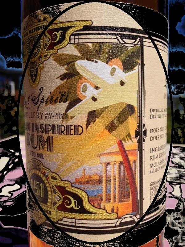
Truly a great label, I'd agree. And our friend Tiare (Mountain of Crushed Ice) found the label so romantic and intriguing that she too felt obligated to bloviate:"While the intense flavor is the big star in the Lost Spirits story, the labeling shouldn’t be dismissed. It’s obvious that a lot of effort goes into the graphic design. The Cuban label is more colorful than the others and evokes the feeling of pre-Castro era Cuba in the 1930s."
"…the stunning label is a work of art with light pastel colored retro style 1930s pre-Castro Cuban theme with palm trees and a Pan Am (?) plane taking off to the sun….(and Cuban daiquiris…) and there`s a lady dressed in fashionable 1930s tropical wear. It`s like the other labels from Lost Spirits, very detailed and in all it`s a stunning label made by Bryan himself."
Just one problem. I thought I'd seen it before...
Allow me to digress.
Living in S. Florida and frequently spending time in Little Havana (Calle Ocho in Miami), not to mention Denny's Cuban Cafe in Key Largo, well, I immediately was struck with the label. I was sure I'd seen the same image in a Pan Am poster. I remembered the structure, the palm tree, the Pan Am Clipper, the backdrop, et al. You see, I love Cuban food, music and artifacts, I love retro art, and dammit I'd have bet my left testicle (the good one) that I'd seen it. Why? I was so struck, that had that poster been on sale I'd have bought it on the spot. I loved it...
So I did my usual due diligence, and found this:
. . . . . . .
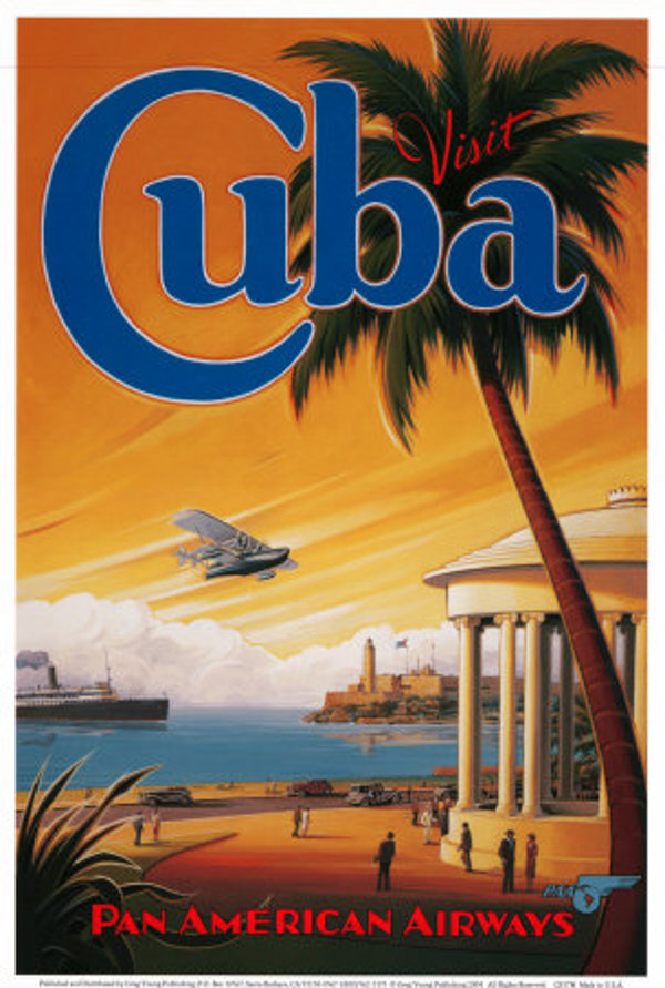
Now although this poster (available on Ebay, Amazon, and on the wall at Denny's Cafe in Key Largo) lacks the Pan Am Clipper plane of the times, I'd bet my remaining testis that it's the plane version that hangs at Denny's. It was that memorable. Seriously, check out these two images:
Same gazebo. Same number of columns. Same fort in the background, same reflection in the water. Same flag extended in the same direction. Same blue swatch of the PA symbol bottom right. Same shadowing. Same three figures, two men and a woman in front of the gazebo,, same orientation. And on and on.
What say you? "A stunning label made by Bryan himself" - or a clever piece of photoshopping? You decide. I've made up my mind. Vaya con burros, Bryan....
*******
http://www.amountainofcrushedice.com/?p=19622
http://cocktailwonk.com/2014/07/the-hot ... d-rum.html

